
Wonder and Grain
Craft Beer / Beverage / Food & Drink
Project Overview:
Wander & Grain Brewing Co. is a small-batch brewery based in the Pacific Northwest, known for using locally sourced grains and wild ingredients inspired by seasonal hikes and outdoor adventures. They’re seeking a full branding identity that reflects their artisanal quality, outdoorsy vibe, and adventurous spirit. The branding should feel authentic and grounded, not overly corporate or trendy. They want to attract outdoor lovers, indie beer fans, and people who care about quality and local sourcing.
I wanted to create a rustic and fun aesthetic while still looking professional by using illustration to evoke a sense of adventure and wonder. I created a video advertisement for TV and social media using Blender. I designed a wilderness scene to produce a sense of freedom and avoided creating a setting that looked like it was filmed in a studio with harsh lighting and an overproduced appearance.
I accomplished this by using realistic lighting and a sepia colour palette to create a sense of nostalgia, similar to when I used to go to the park with friends as a child, searching for adventure. I created 2 versions of this one for horizontal and one for vertical to fit different use cases.
I also created two hero posters for billboards and bus stop signage in both horizontal and vertical variations. This ensured the designs were adaptable across different formats and viewing contexts while maintaining a consistent visual identity.
I used Citrus Gothic Inline as the primary font for the brand, as I wanted something bold and strong that would stand out clearly at a distance. Its distinctive style helps reinforce the adventurous and rustic aesthetic while remaining legible and impactful across large-scale applications.
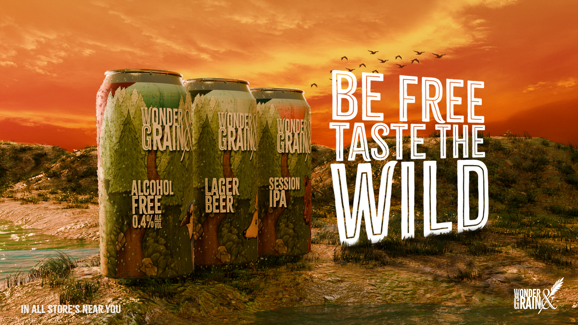
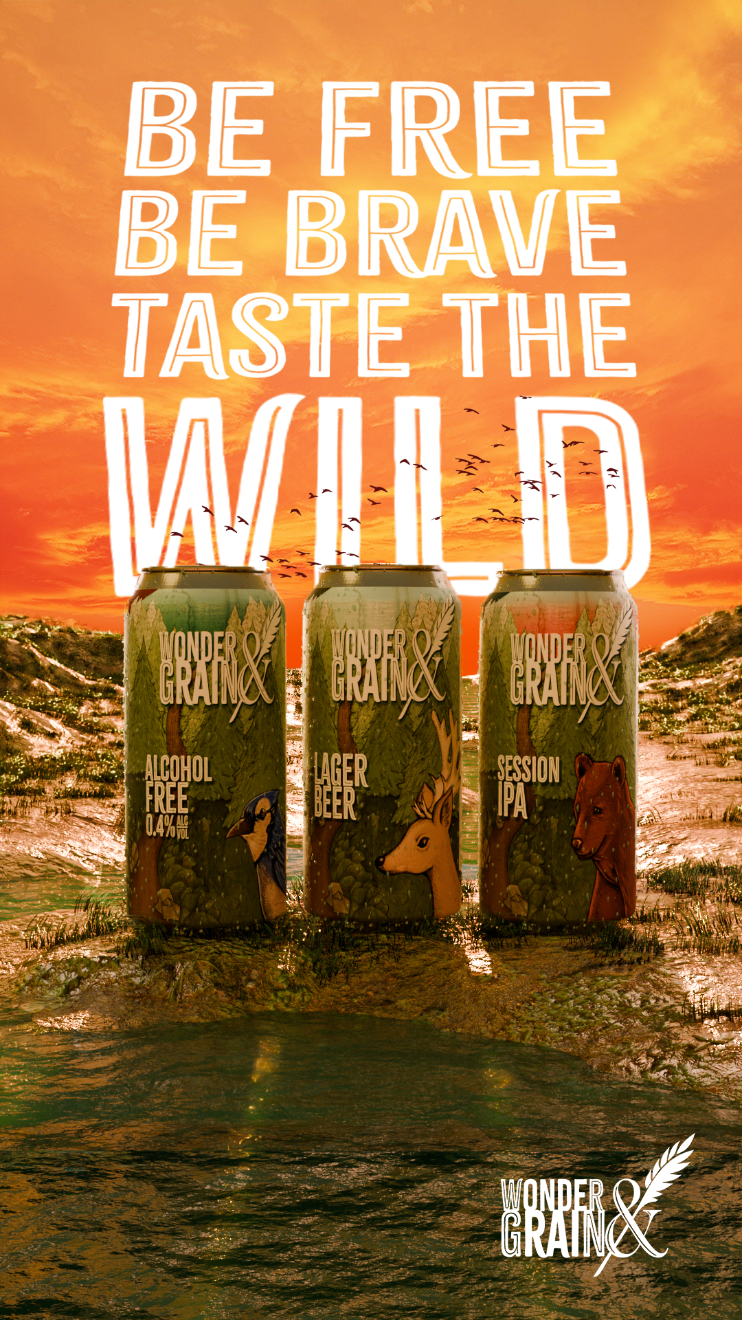
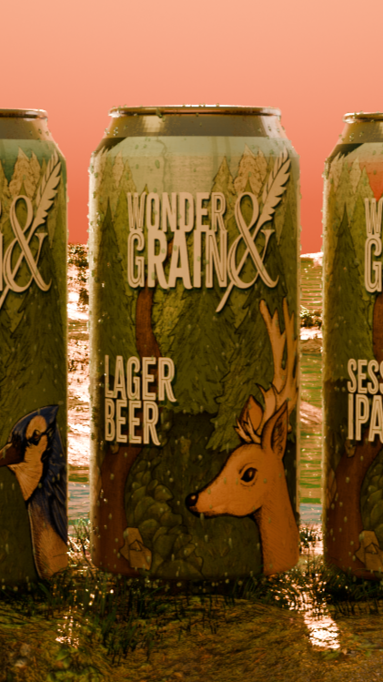
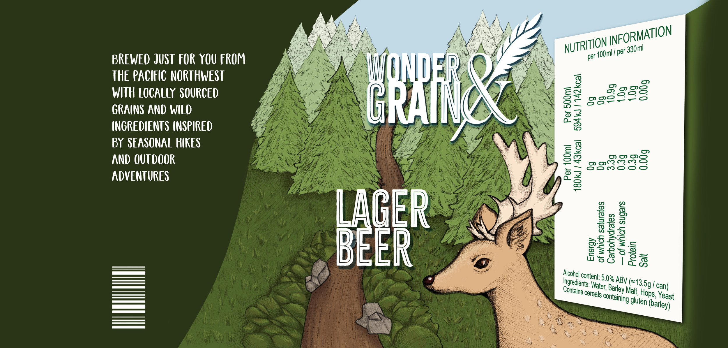
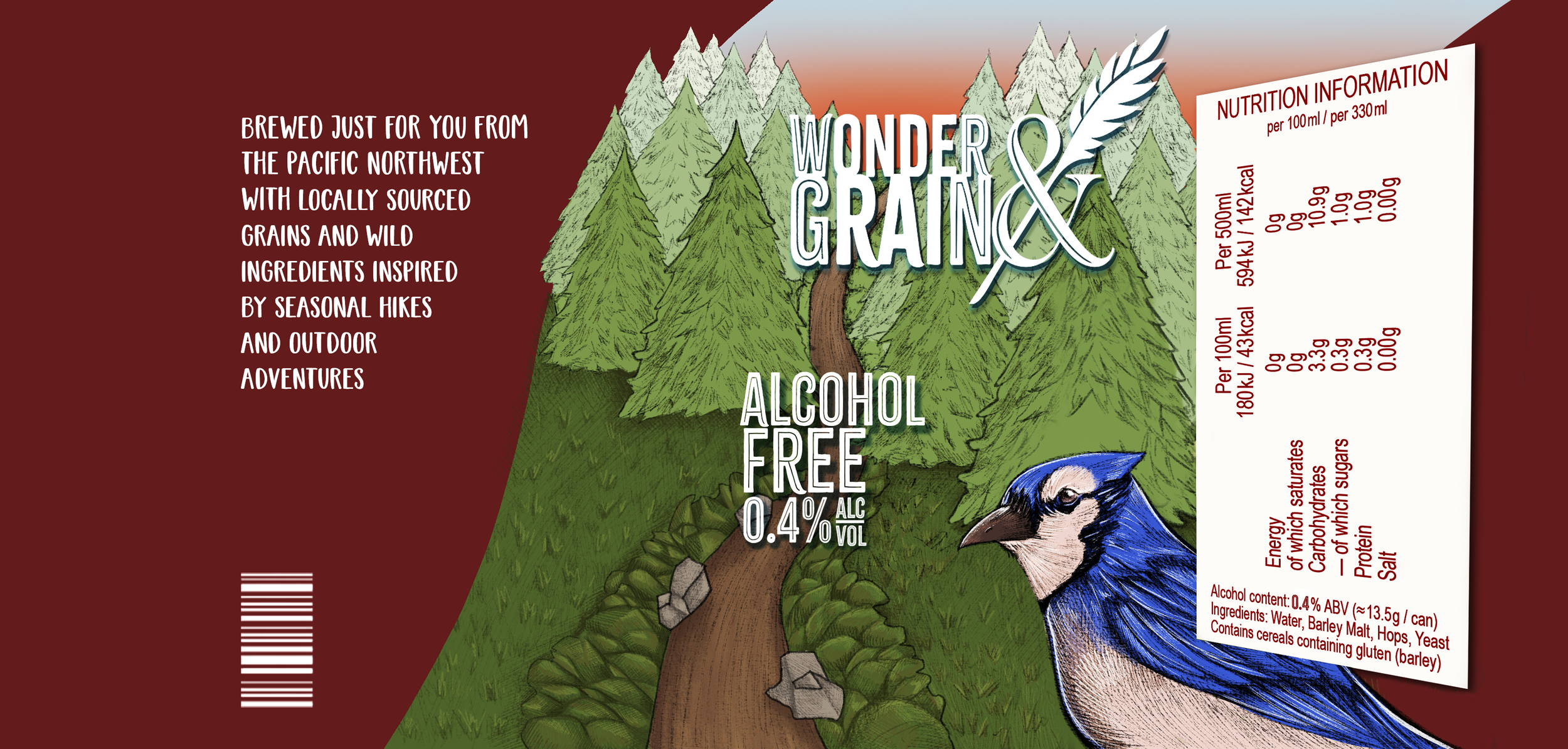
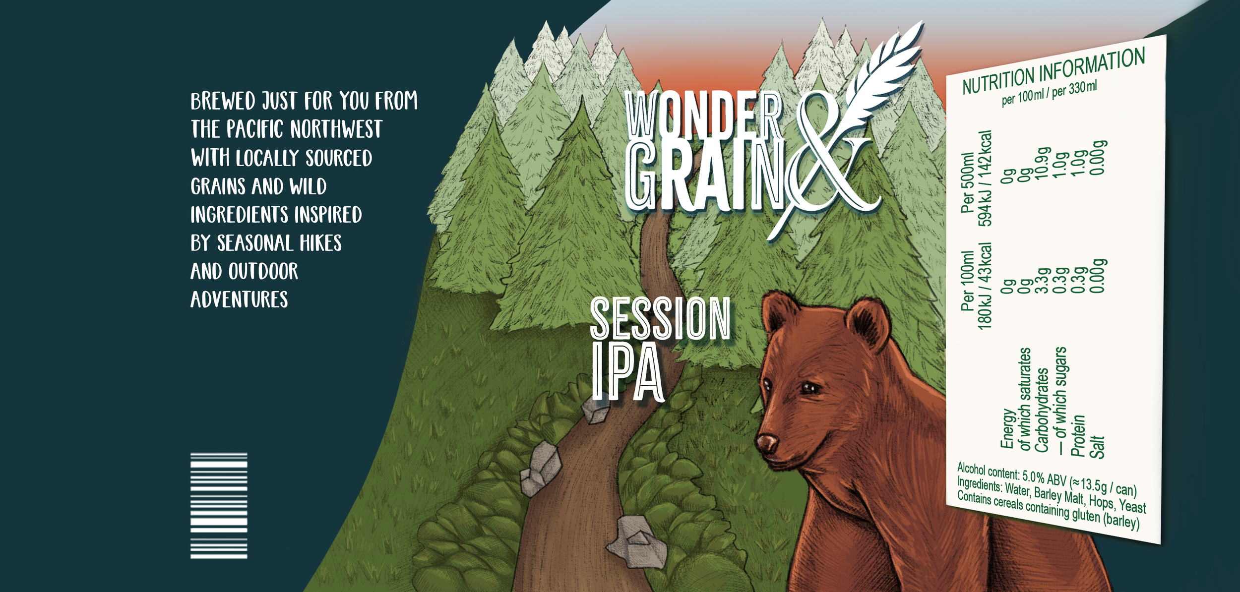
For the labels, I created three different variations, each featuring a distinct colour palette that still works harmoniously when displayed together. For the main design, I chose a different animal for each variation, as they represent adventure, wildlife, and freedom to me.
For the background, I illustrated a forest scene with a path running through the centre, inspired by the Pacific Northwest, where the grains for the beverages are sourced. This visual element helps reinforce the brand’s connection to nature and origin while supporting the overall theme of exploration and discovery.
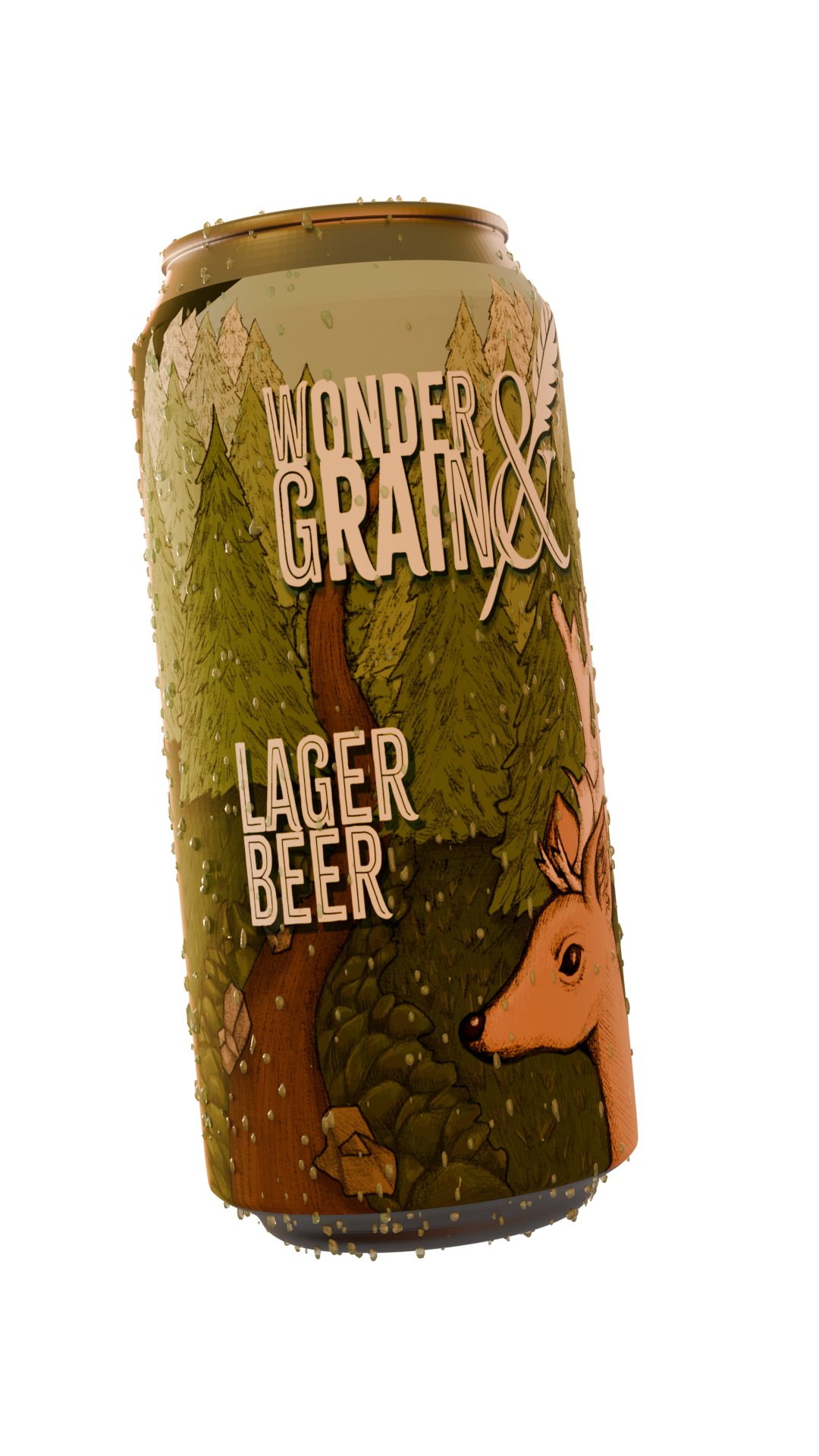
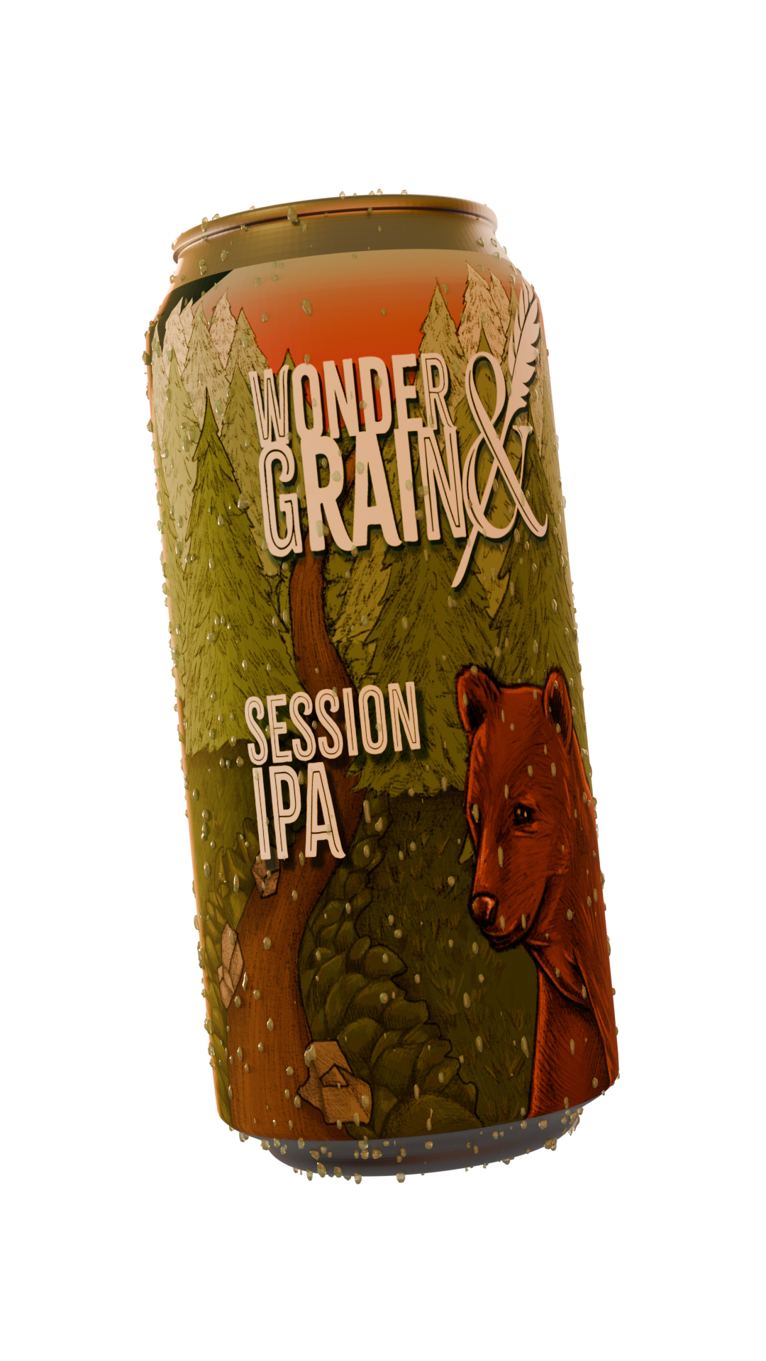
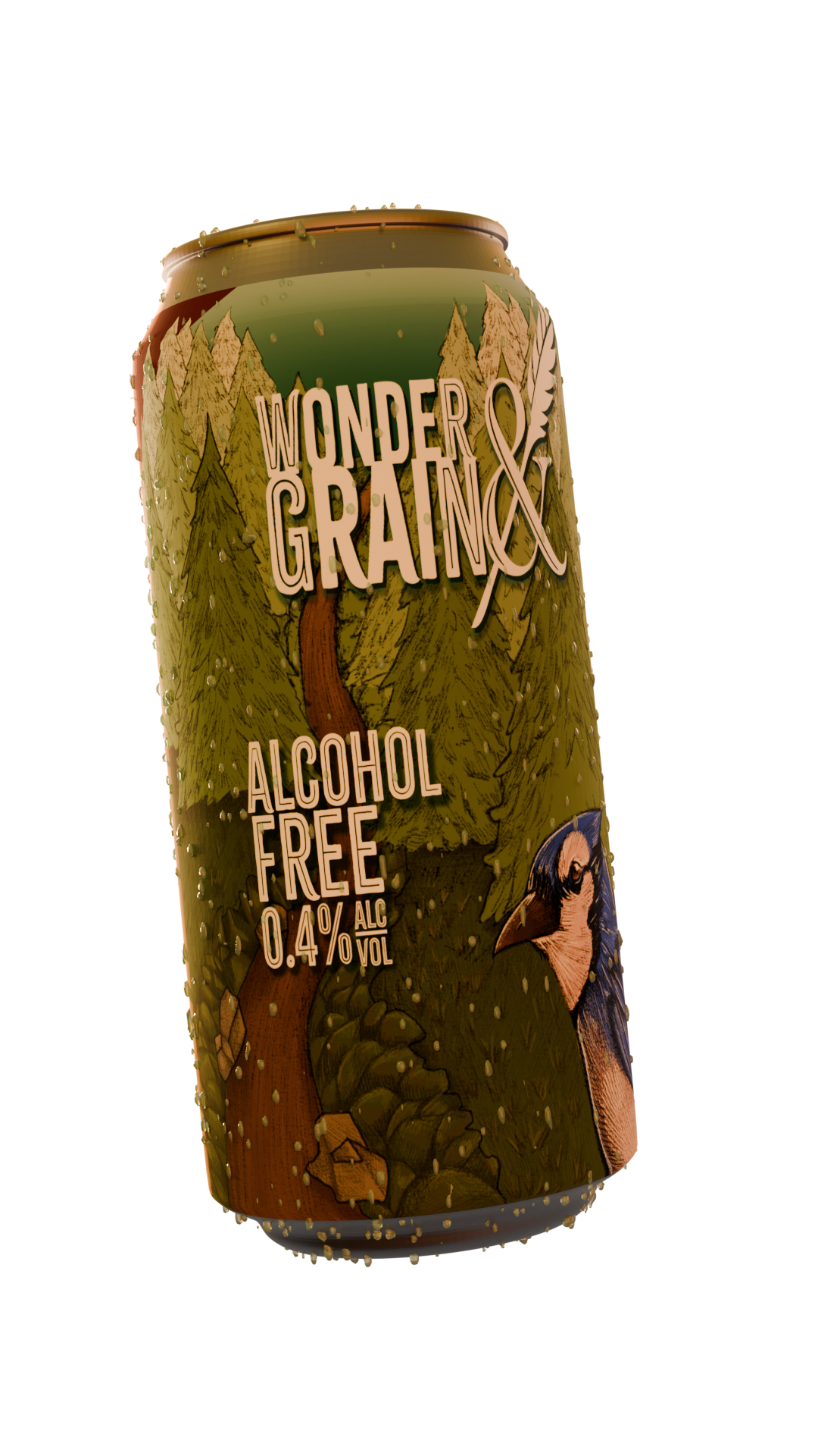
I created the label designs using Photoshop and Illustrator, and used Blender to produce realistic can mock-ups for each design. I developed three different variations for each beverage, ensuring there was visual interest and variety while still adhering to a coherent aesthetic across the range.
This approach allowed me to maintain brand consistency while giving each product its own distinct identity within the overall design system.
I also created a tap design for bars and pubs using Blender in 3D. I chose to make the base out of dark wood to maintain the rustic aesthetic, and used a lighter shade for the logo so it stands out clearly against the darker surface.
My aim was to keep the design simple, ensuring it would be easy to manufacture and adaptable for future updates or changes. At the same time, the simplicity helps make the design more memorable and recognisable in busy bar environments.
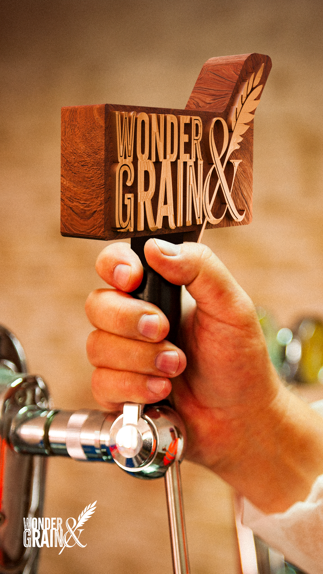
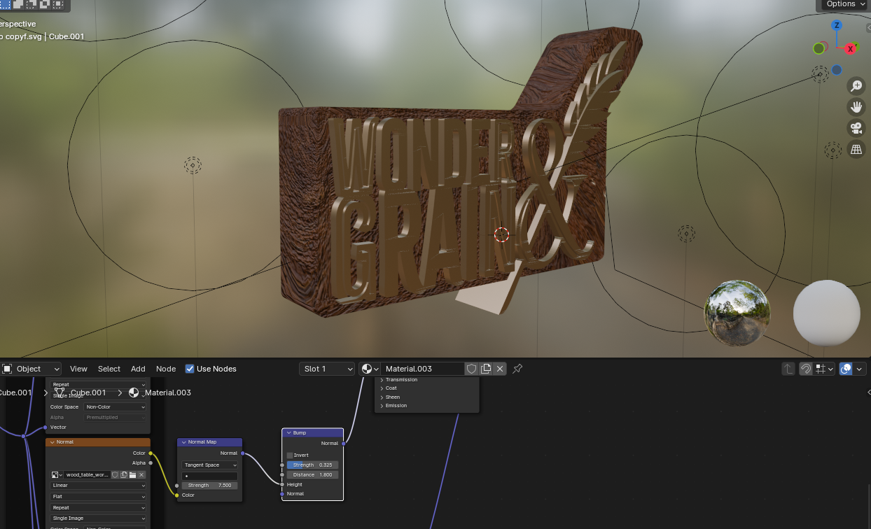
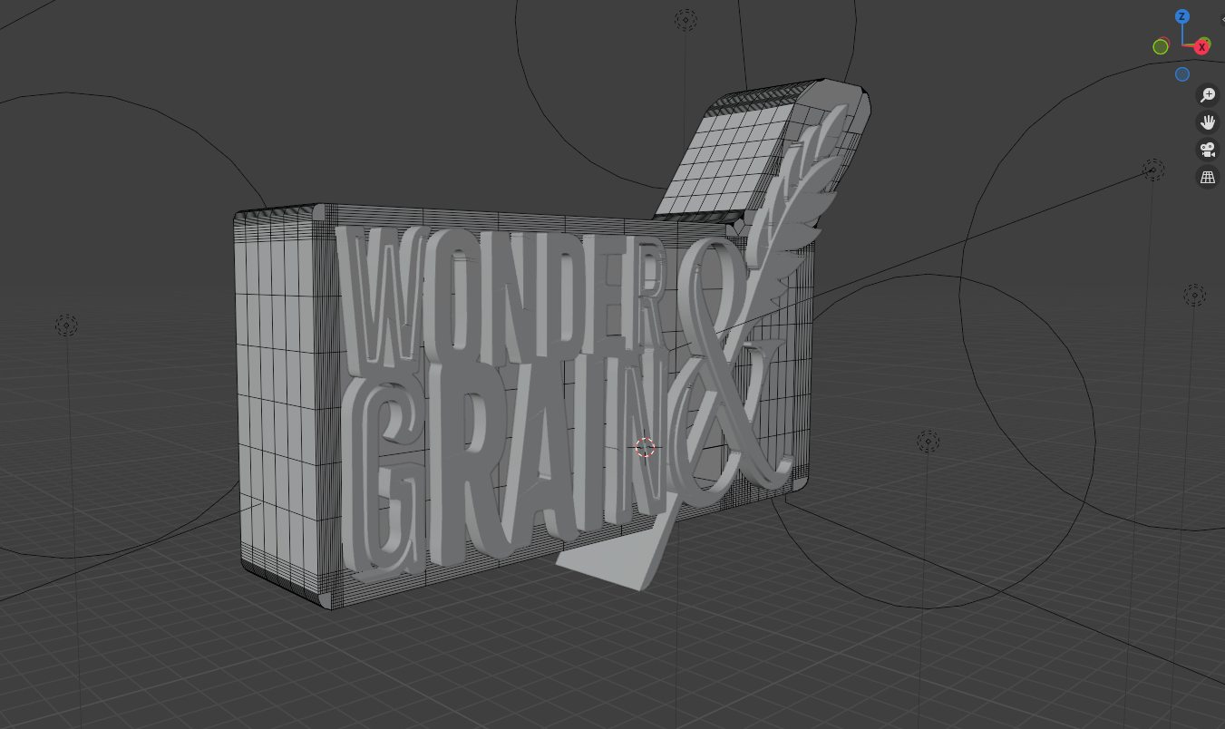
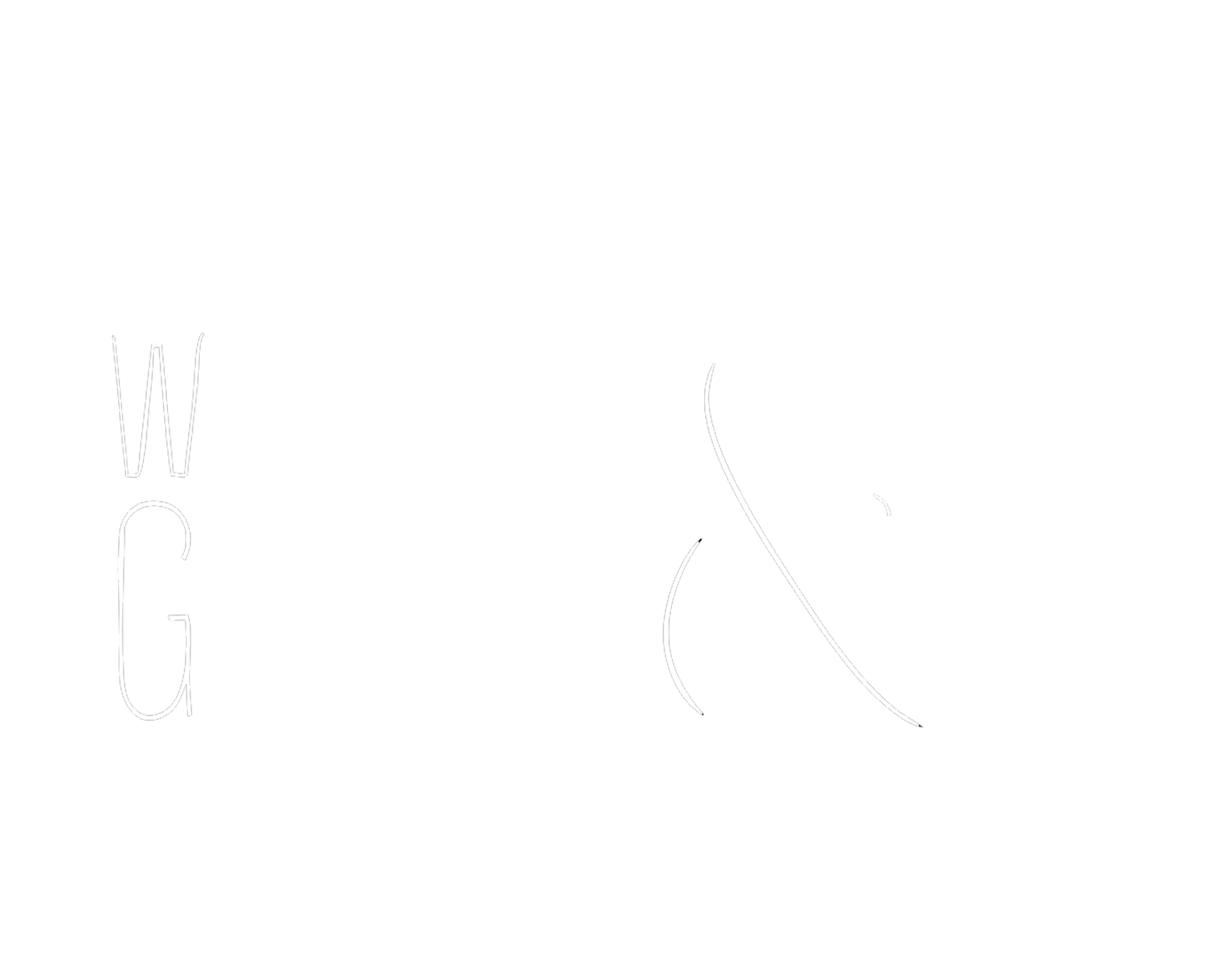
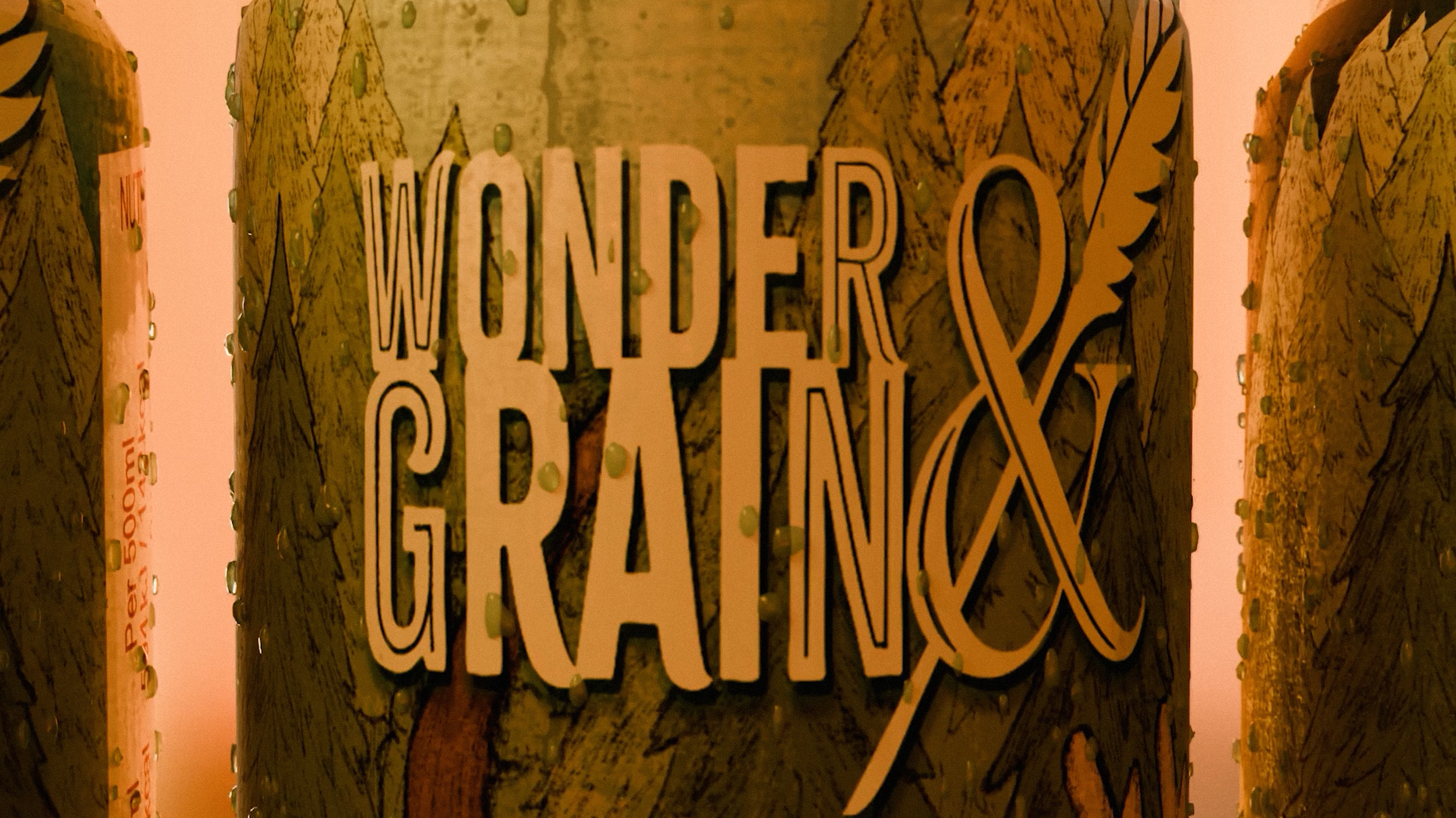
For the logo, I used Citrus Gothic Inline as the base typeface, as its bold and distinctive style helps it stand out clearly on labels and other merchandise. I incorporated a grain stalk running through the ampersand to further reinforce the rustic identity of the brand, while also visually linking the design to the natural ingredients used in the beverages.
This detail helps communicate that it is part of a larger, cohesive brand while maintaining a strong and memorable visual presence.