
SUNSET MILEAGE
Album Cover / Music / 12” Vinyl LP
Project Overview:
Sunset Mileage is a conceptual vinyl record album centred around themes of nostalgia, memories, and the passage of time, inspired by the atmosphere and visual style of the 1980s. The songs reflect on moments from the past, including youth, road trips, summer evenings, and experiences that become more meaningful over time.
The goal is to create a cohesive album cover and merchandise that reflect the themes explored throughout the album and its songs. I am using 1980s films as inspiration to create a vintage feel while maintaining a somewhat modern aesthetic. I will also draw inspiration from my own childhood, incorporating elements such as arcade games, space, and the universe. The visual identity will combine warm sunset colour palettes, retro typography, vintage photography, and subtle neon elements to create an authentic 1980s-inspired aesthetic.
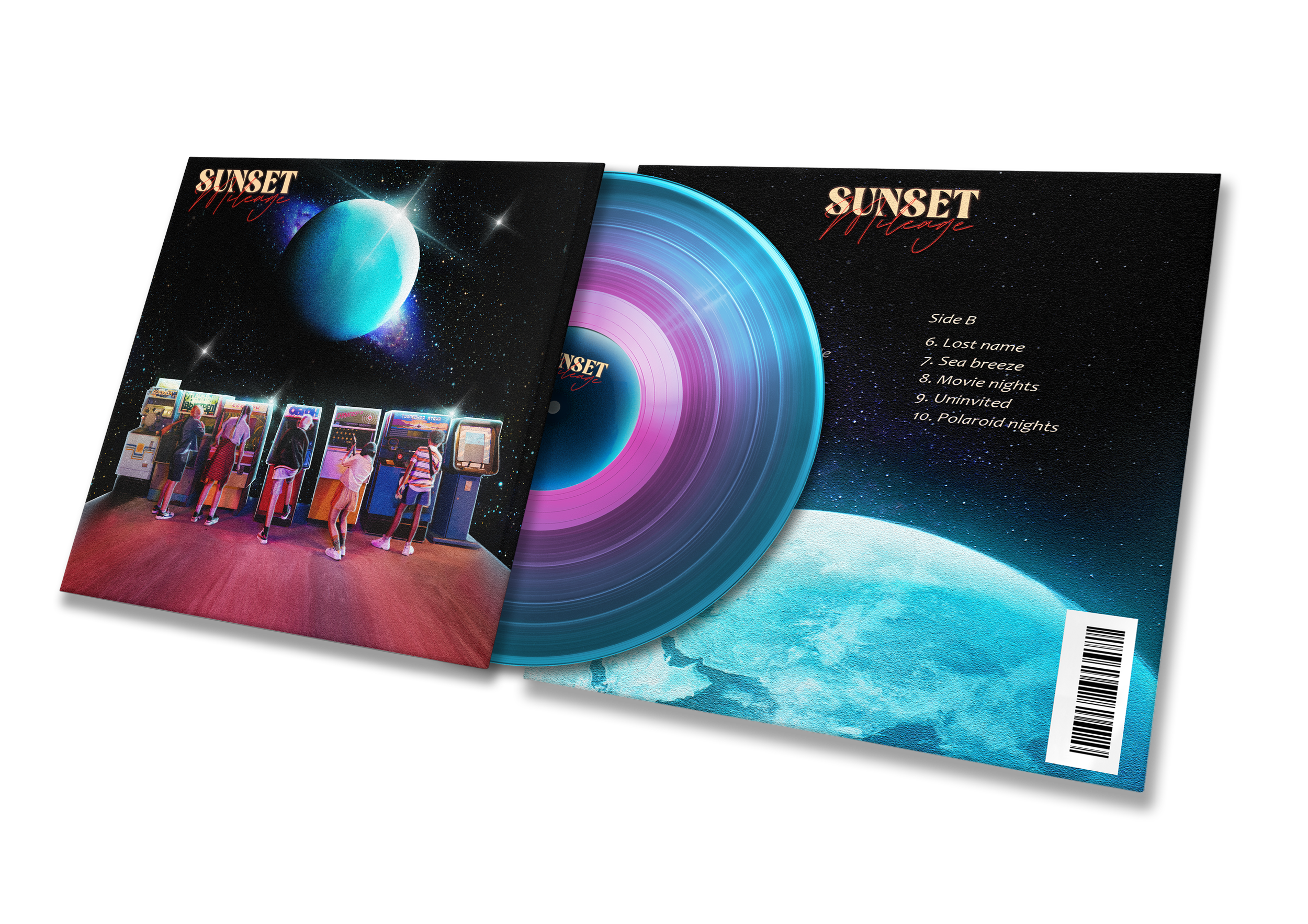
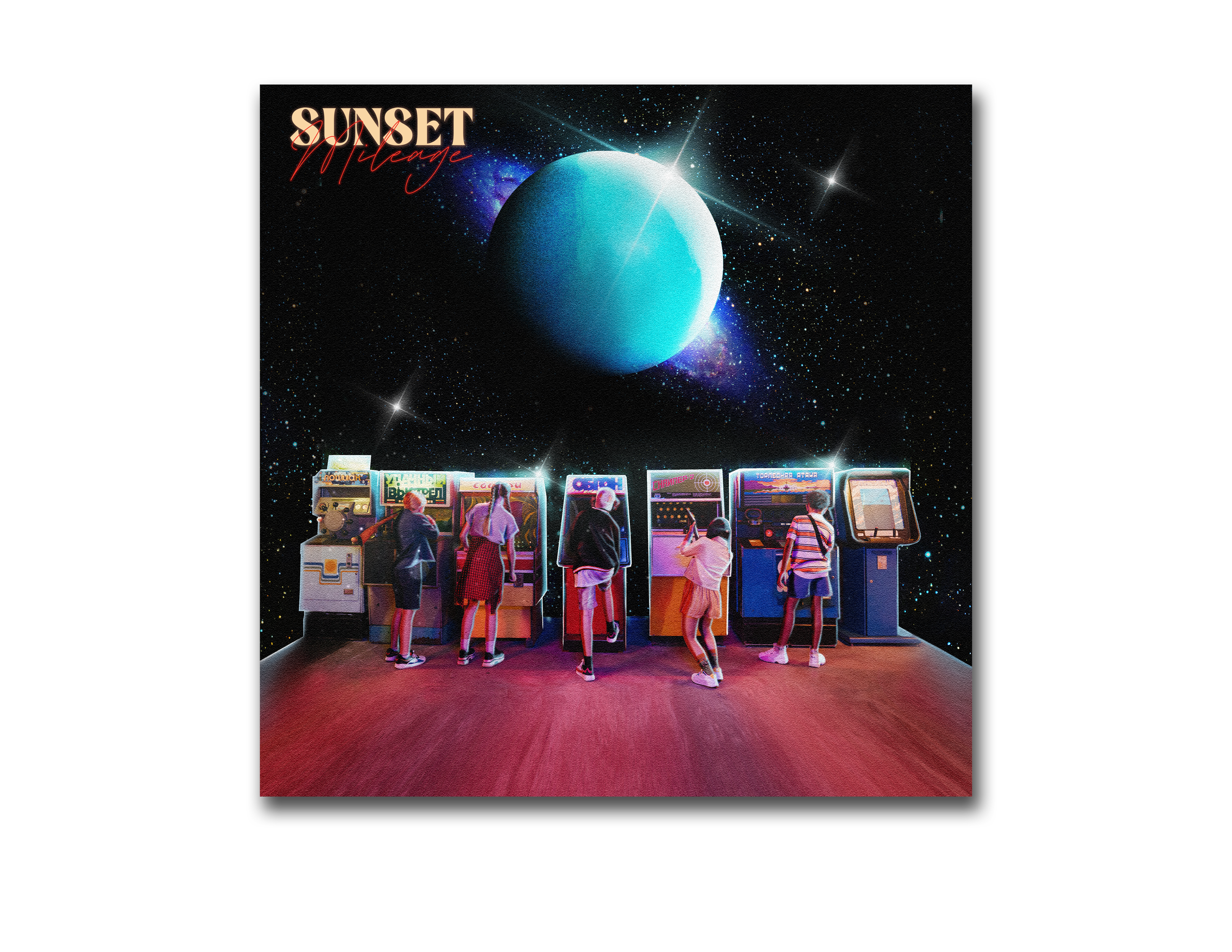
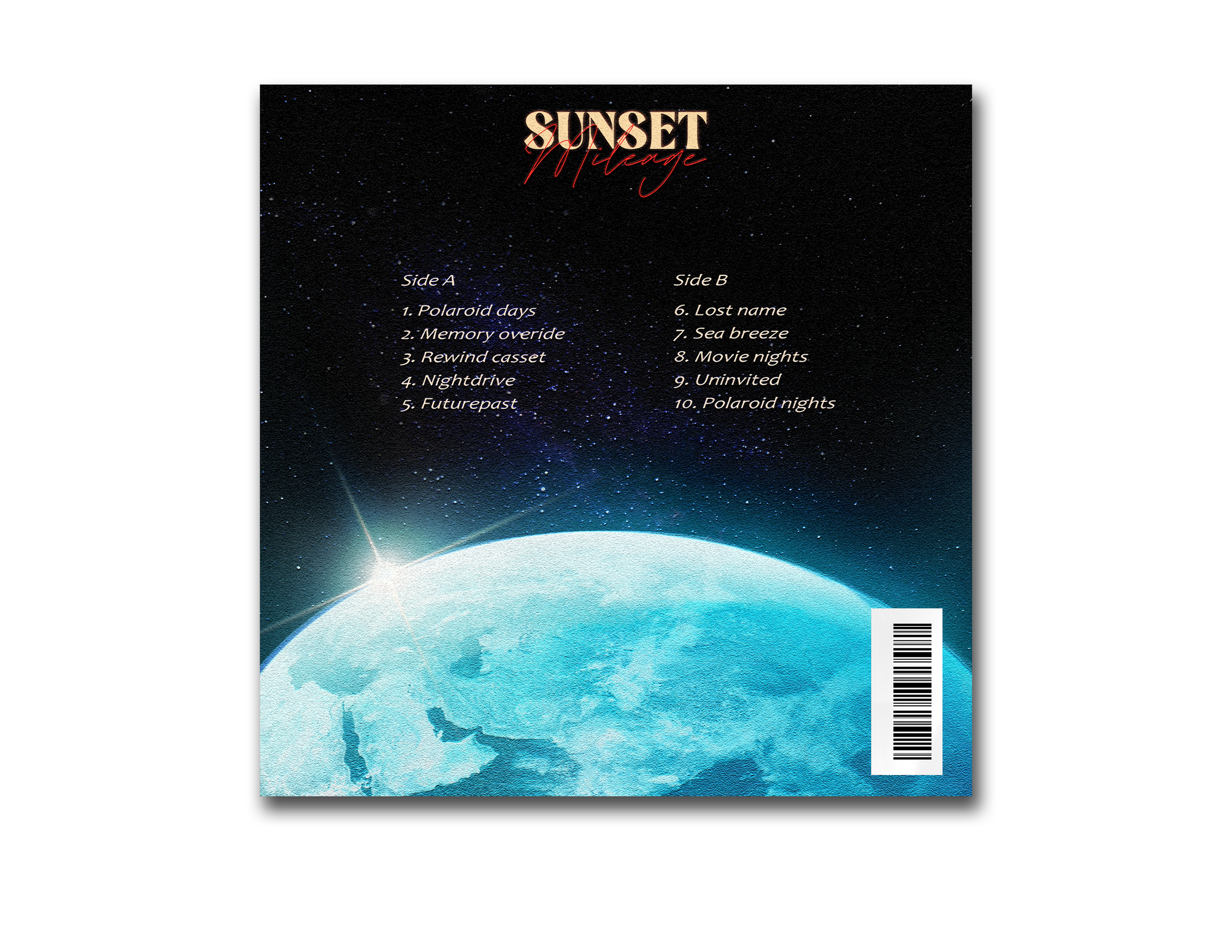
SIDE A
For Side A, I decided to create an 80s arcade scene featuring children playing retro games to evoke a sense of nostalgia and innocence. This was important to me because, when I think about the past and the memories reflected in the album, I always think of the good times I spent playing games with friends.
In the background, I gradually transitioned the scene into a galaxy to create the feeling of being transported to another world as a child, capturing the curiosity and wonder we often feel about the world around us. For the planet, I designed it as an arcade joystick, as I felt it would create an interesting visual while reinforcing the surreal, dream-like aesthetic I wanted to achieve throughout the imagery.
SIDE B
For Side B, I decided to zoom in on the planet and position the viewpoint slightly above it. This helped create a stronger sense of cohesion between both sides, making the transition feel more seamless rather than presenting two completely different images. On Side A, the viewer is positioned behind the characters, whereas on Side B, the perspective moves past them and towards the planet in the background.
This closer viewpoint allowed me to add more detail to the planet while also creating negative space due to the angle of the composition. I used this space to display the track names clearly against the dark background, improving their legibility. I also moved the logo to the centre, as I felt it aligned better with the track listing and created a more balanced composition.
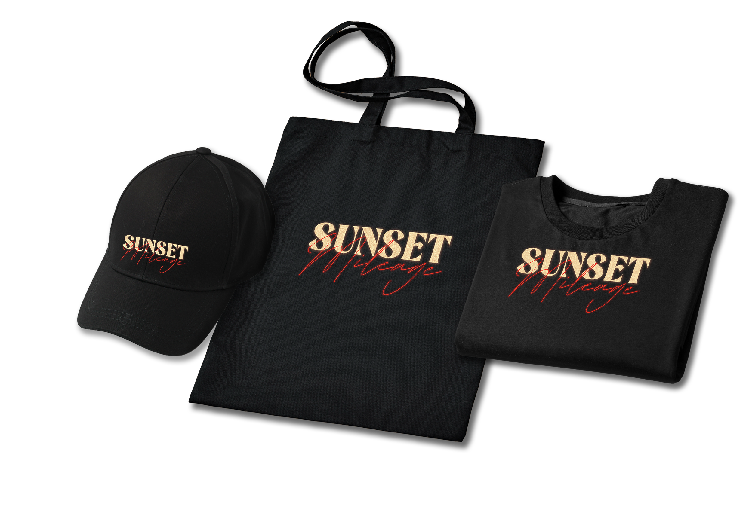
For the merchandise, I wanted to keep the designs simple but effective. I chose a predominantly black colour scheme for all of the items, with the logo placed prominently to ensure it stands out against the dark background, making it more noticeable and memorable from a distance in a retail setting.
I maintained this design approach across every item to create a cohesive collection. By keeping the branding consistent throughout, the merchandise feels like a matching set, encouraging the target audience to purchase multiple items rather than just one.
Colour Palette

For the colour palette, I decided to use a neon colour scheme inspired by the 1980s, as I felt it would create a nostalgic and dream-like atmosphere that complements the themes explored throughout the album. I chose black as the primary background colour to help the brighter colours stand out and create greater visual impact.
I wanted to avoid using shades of yellow and orange, as I felt they have become clichéd and are often overused to represent nostalgia and memories. Instead, I opted for tones of blue and pastel pink, which evoke a similar sense of nostalgia while giving the design a more distinctive and contemporary feel.
Logo and Font
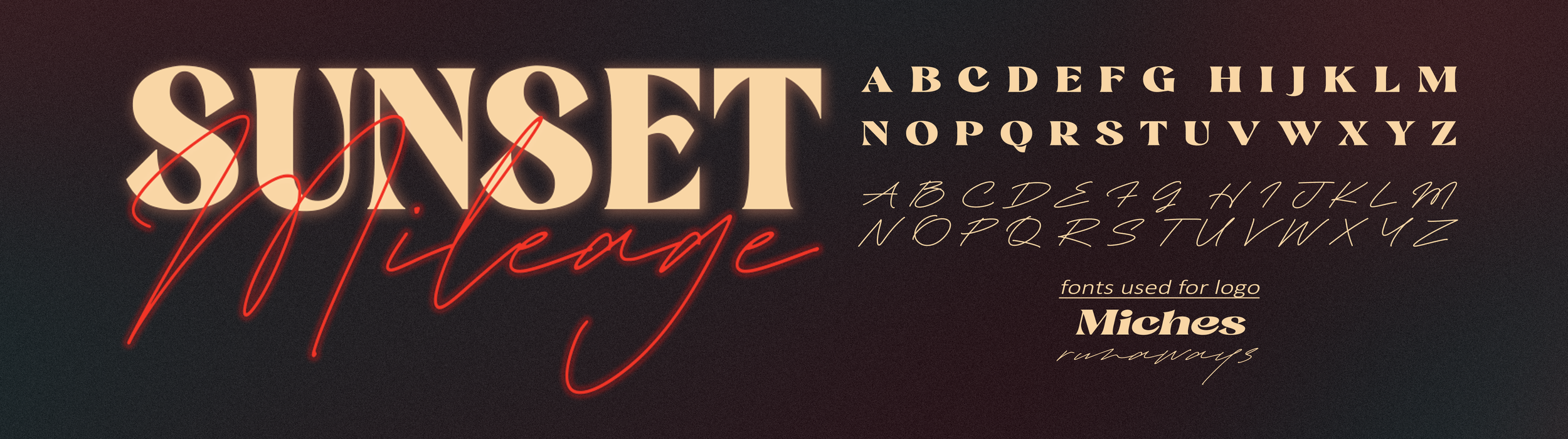
For the logo, I wanted to maintain a retro aesthetic inspired by the neon signs commonly seen on the streets during the 1980s. I felt that the typeface Miches suited this style perfectly, as its rounded shapes and sharp edges create a strong visual contrast while reinforcing the retro look.
For the word "Mileage" I wanted to lean even further into the neon sign aesthetic, so I chose the typeface Runways. I felt it created an effective contrast with Miches, and together the two typefaces combine to form a distinctive retro-inspired logo that reflects the album's nostalgic themes.